Accuracy, Quality & Scale: How Hudl IQ Creates Football Data
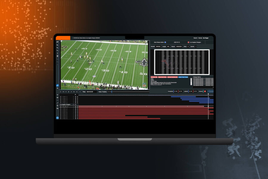
We go under the hood to examine how Hudl IQ captures, analyzes and builds data models for American football teams to give your staff a better understanding of how and where to focus when getting started with advanced analytics.
In early 2022, we launched the product that would become Hudl IQ. In those short 2 years, we have gone from people wondering who we are to wowing people with our data and analytics tools. When people discover Hudl IQ, their minds are blown with what we can do to assist them in better analyzing a play, a game, a player, or a team.
Let’s take a look at what that data looks like including the data creation process, what type of data we create, and a few things we do with the data.
Data Creation
Tracking Data
Tracking data is the lifeblood of the sports analytics community. It is also the lifeblood of what we do at Hudl IQ. We collect data 30 times per second and this data rolls up into our high frequency tracking offering. Our frame by frame tracking data of all 22 players on the field includes the following for every player: x,y location on the field, speed, acceleration, and distance traveled from the last frame.
We use a hybrid collection process that utilizes both computers and humans to collect data from video. This process allows us to harness the speed and efficiency of machines, while also giving room for the flexibility and accuracy that comes from manual intervention. The initial pass of the video through our machine learning algorithm identifies the area of the field that is being shown on the video. It then overlays the yard markers, sidelines, hashes, and any other identifiable lines onto the video. This allows the collectors to validate what part of the field is being shown. The field continues to update as the camera pans and allows us to be confident with the locations that come from the next steps.
The next phase of computer vision is to identify the players on the field. Our algorithm identifies players on the field as well as referees (which we remove from the collection process at this point). This is repeated for every frame of the video. This creates the player tracks that make up the player tracking data. The locations of the players are superimposed onto the field that was diagrammed in the step discussed above.
Sounds simple enough, so where do the humans come in? One step that involves manual oversight is fixing any errors that arise from the computer vision process. Any misidentification of the field can be easily fixed in the collection software. Another area where manual intervention comes in is correctly identifying who the players are. This is still difficult for computer vision software, especially if a team has difficult-to-read jersey numbers (like white jerseys and silver numbers).
The last step is making sure all the tracks are correct. One step is to link the player paths when/if they leave the screen and come back into the video. Another major role is to make sure the tracks stay with the right players. This can be difficult when there is a large grouping of players that come together (offensive lineman blocking defensive lineman, tackle attempts, etc).
Event Data
After building the tracks for every player, we then add a layer of collection we call event collection. The majority of these events are things that happen around the ball. Some of the most common events are the snap, handoff, fake handoff, throw, tackle attempts, catch attempts, and many more.
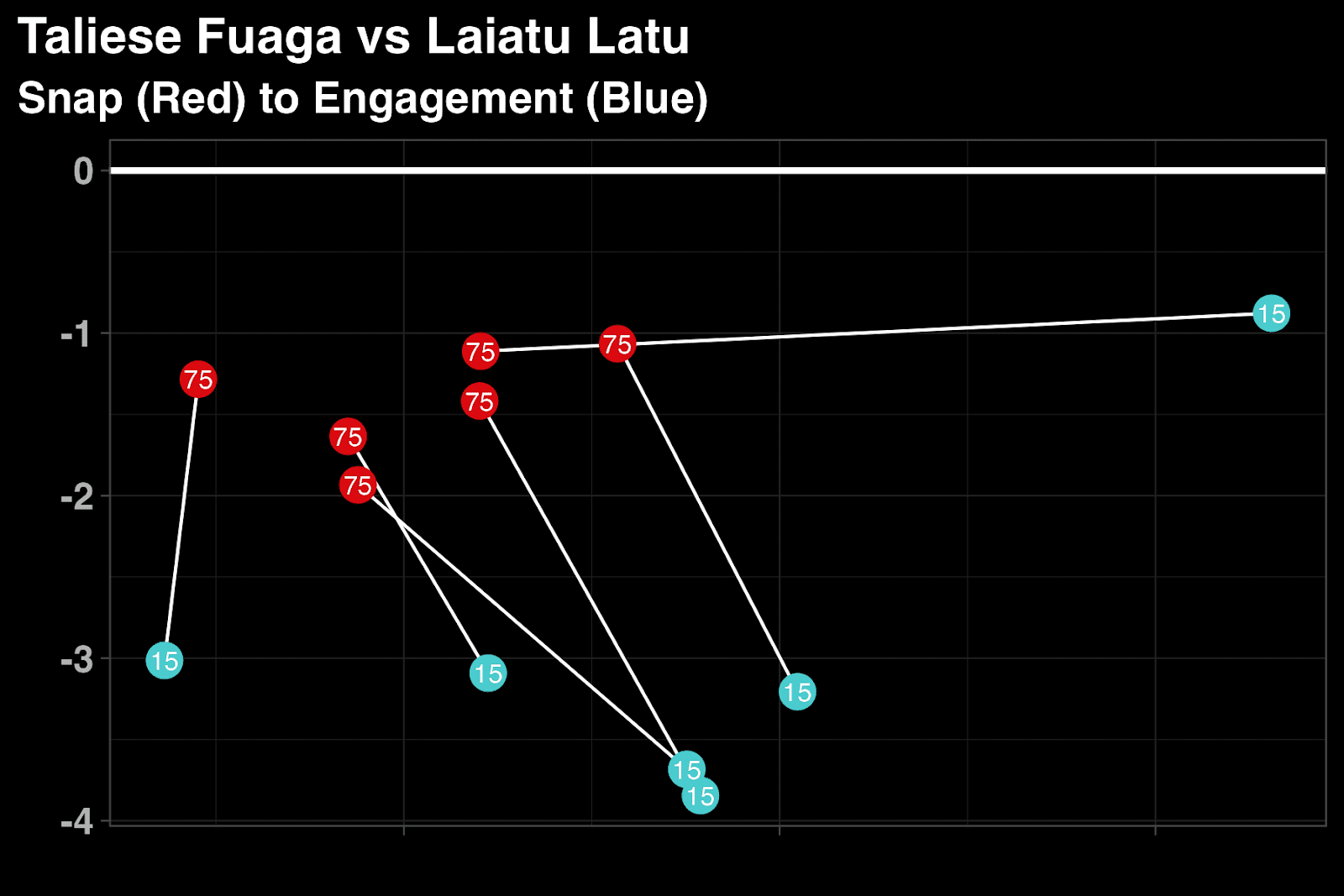
The other main part of the event collection does not necessarily follow what happens around the ball. The line engagement data captures every block that happens inside the box. This includes the location on the field of the start and end of the block, the timestamps of the beginning and end of the block, the players involved in the block, and what type of block it is (single or double team). This data is what we call line engagement data. The idea behind the line engagements collection is to capture information for the big guys up front. There is very little data available in the trenches, and we wanted to rectify that. Below is an example of how the line engagement data might be used. This looks at a specific matchup of two first-round picks from this past draft.
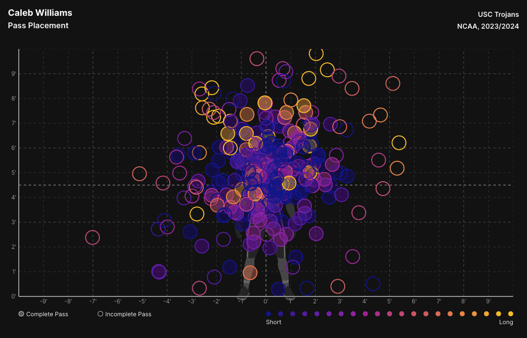
The last piece of the event collection is our pass location data. This captures the location of the ball at the time of the catch attempt by the targeted receiver. This is measured in terms of distance away from the center mass of the receiver. Below you can see an example of what that data looks like in a visual tool from Hudl IQ's analytics platform.
Unified Data With One Timestamp
The tracking data and event data are collected on the same video with the same timestamps. This means you get a unified tracking and eventing stream of data. This data leads to the deepest analysis available anywhere. No data has the capability of replicating the tracking data we produce mixed with eventing data. Not the NFL NGS data, not PFF, no one. When I wrote earlier that we produce the premier football data product, this is what I’m talking about.
Player Play
After the data is collected, the tracking data and eventing data go through an enrichment process. During this process, there are many stages of quality assurance to ensure the accuracy of the data. Quality checks ensure that the data we produce is of the highest standard, as any inconsistencies can be further explored at this stage before the data is finalized. For example, these flags include players running impossible speeds, locations of tacklers who are too far away from the ball carrier, and weird down and distance combos based on yards gained. Some of these potential flags are possible (We see you Notre Dame with 10 players on the field against Ohio State last season), and are there to make sure the collectors are aware of potential problems.
This enrichment process populates the statistics that make up the bulk of our play-by-play data. One aspect of play-by-play data is what we call player play data. Every player has their own set of information about the play. This includes their initial alignment and alignment position, movement path for the play, physical metrics, and any of the events they might be involved in. Breaking each play down by player makes it more efficient for users to get individual player information from a play, game, or season.
Play-By-Play
The last dataset is the play-by-play dataset. It contains all of the high-level information you would expect about a play: down, distance, field position, EPA, offensive formation, defensive coverage, blitz, and much more. In an effort to cut down on time, we “tag” as few things as possible, and rely on the enrichment process to populate a lot of the data. Much of this data is based on data science models or logic-based rules that are created by our in-house data science team.
EPA, defensive coverage, receiver routes, completion percentage over expected, catch rate over expected, and defensive pressure probability are a few of our most recent models. Some other data points like offensive formation, defensive fronts, stunts, and blitzes, are created using logical rules based on the locations of an event frame, or from the player tracks. The models and logic-based fields are built into the enrichment pipeline so that in any game that is collected, we get 100% of our data as soon as the game is finished.
Data Available In the Hudl IQ analysis platform
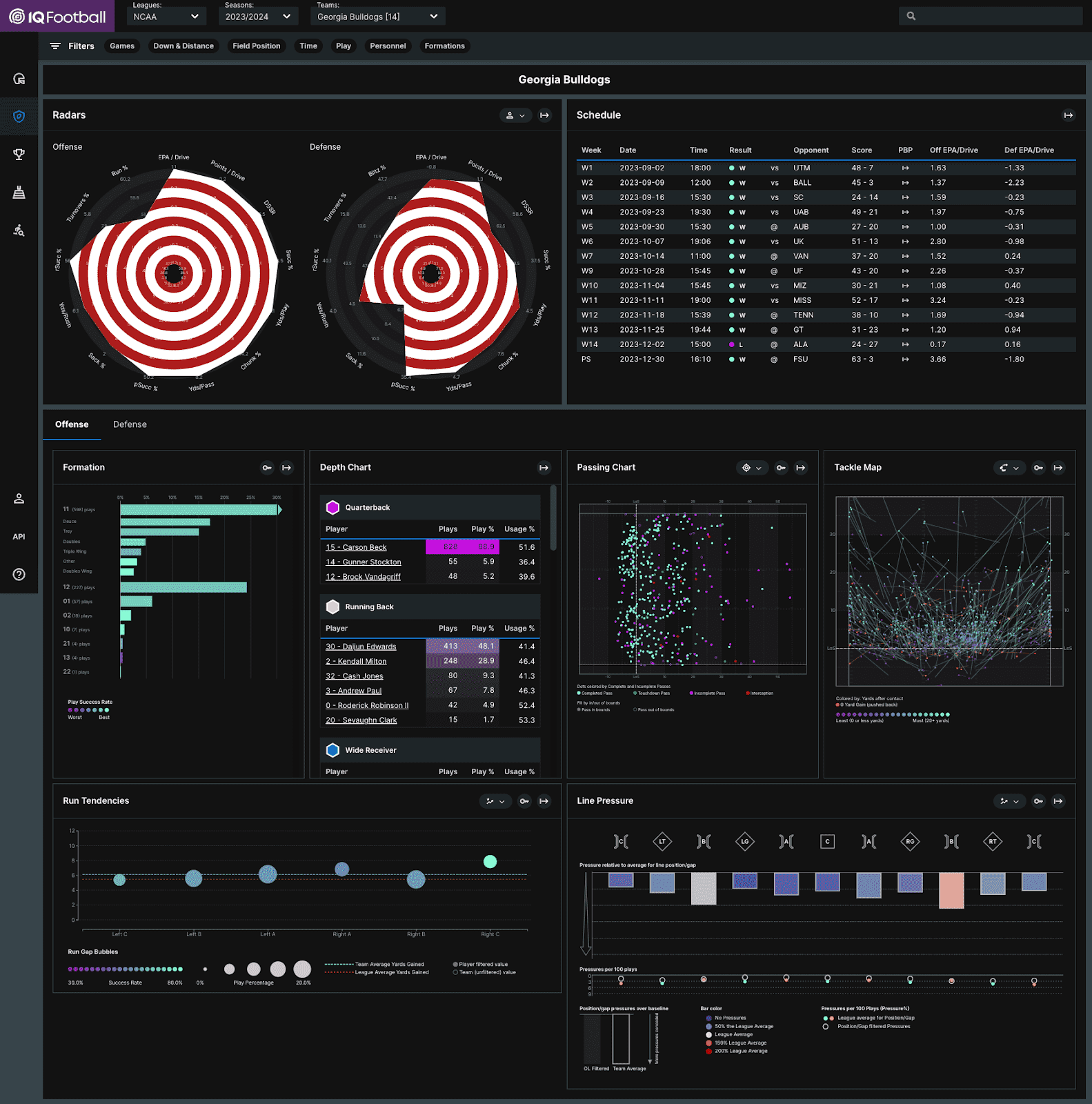
After each of these steps, the data is done and ready for use. In addition to the raw data which can be accessed via an API, our advanced analysis platform is filled with world-class tools. These tools break down the data at the play, player, and team levels. For each of these levels, let’s take a look at one of our visuals that helps describe either the data or what we are doing with it to help our clients.
Play Analysis
There are a few tools in our play section, but the snap frame tool helps show off some neat things about the data. First, it shows our event collection, each of these frames is taken from the snap event (we also have frames for every event collected on each play). This also shows the precision of the player tracking with locations down to the tenth of a yard.
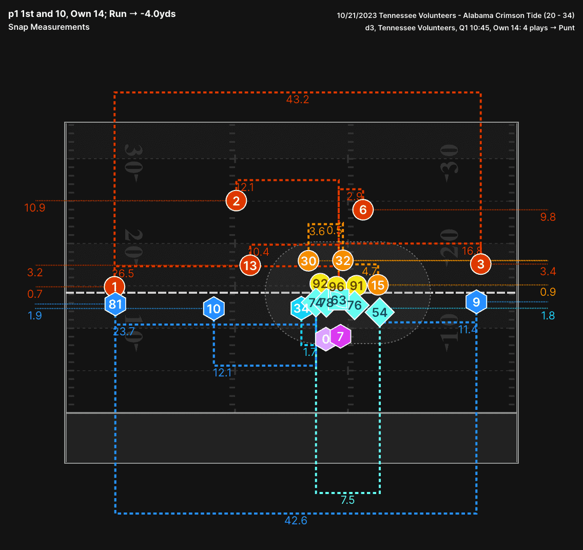
The above visual shows the location of all-22 players at the time of snap from a play during the Tennessee vs Alabama game last season. Tennessee has a unique offense where their receivers are pushing the limits of how wide they can line up (over 43 yards apart on this play!). This width makes it hard for defenses to disguise what they are doing. Using our tools we can see that Alabama pressed the field receiver, while playing tight coverage on the boundary receiver (3.4 yards alignment depth). They also play inside leverage with both the safety and nickel player on the slot receiver to the field.
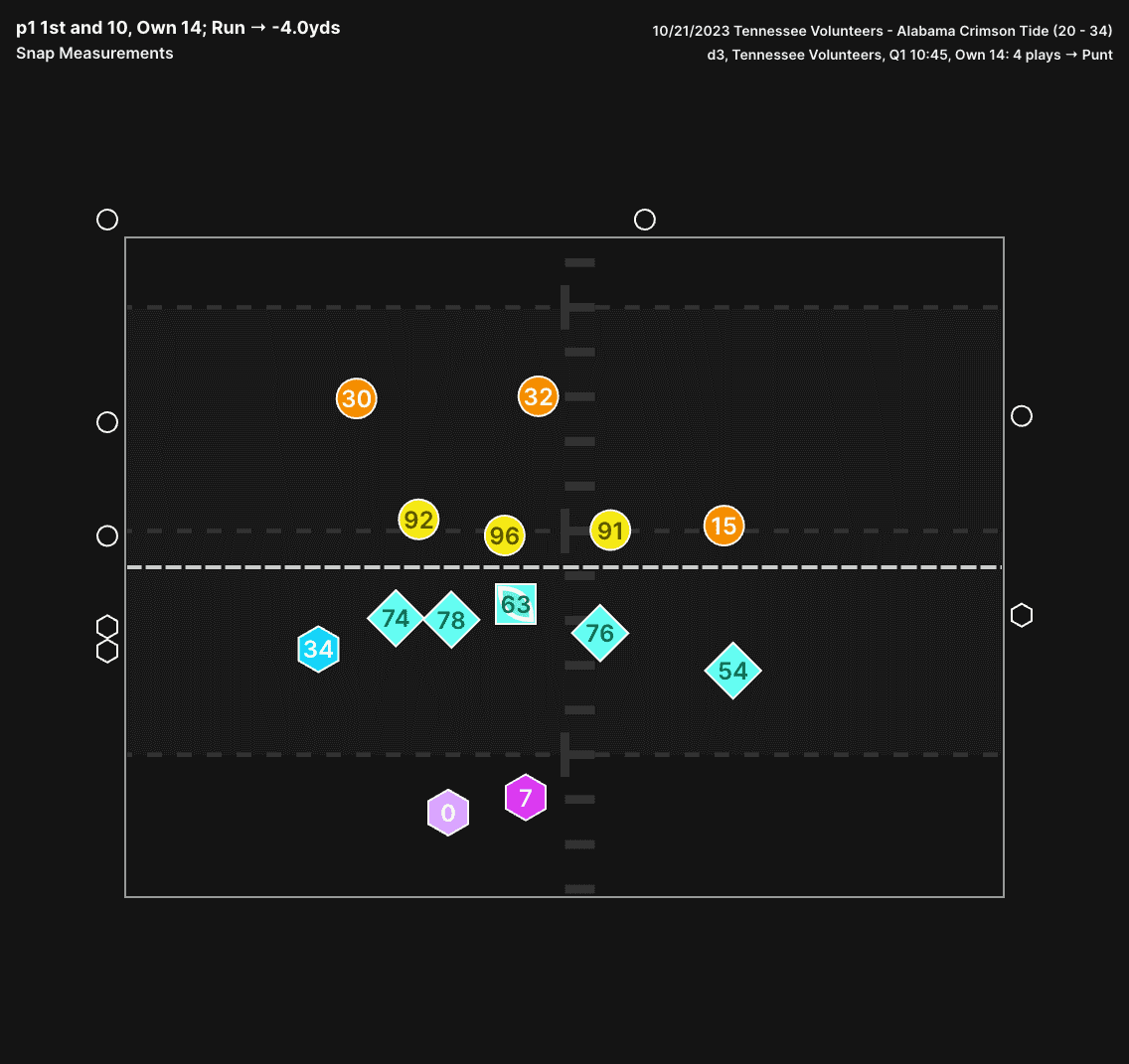
Even though Tennessee spreads their formation out, we are able to zoom in on the offensive line to see what is going on with the big guys up front. The Left Guard and Left Tackle are right up tight to the line of scrimmage, while the Right Guard and Right Tackle are farther off the ball. They also have much wider splits than the left side of the line. For a long time defenses have placed an emphasis on alignment of receivers, and looking for any tendencies these might show. Now, they can do the same thing with the offensive lineman.
Player Analysis
At Hudl IQ we're known for our Radars visualizations. We have two areas where radars show up in our analysis tools, and the first is in the player section with our player radars. The radars are made up of statistics that are placed around the outside with colored areas showing where a player rates in those statistics. The longer the “spike” in a particular direction, the higher someone rated in that statistic. Each player has two radars, a trait radar and a performance radar. The trait radar shows how a player plays the position, while the performance radar shows how a player performs in that role.
We have created radars for quarterback, running back, wide receiver, offensive line, defensive line, linebacker, and secondary. Each position template is unique. The statistics used for each player were chosen after analysis was done on the most important, most stable, and most predictive measures for each position. The player radars for the offensive line is another area where our line engagement data takes center stage. Without all the newer metrics from that, the radars would be awfully sparse.
Using Patrick Mahomes radar from 2024 as an example, let’s break down the player radars.
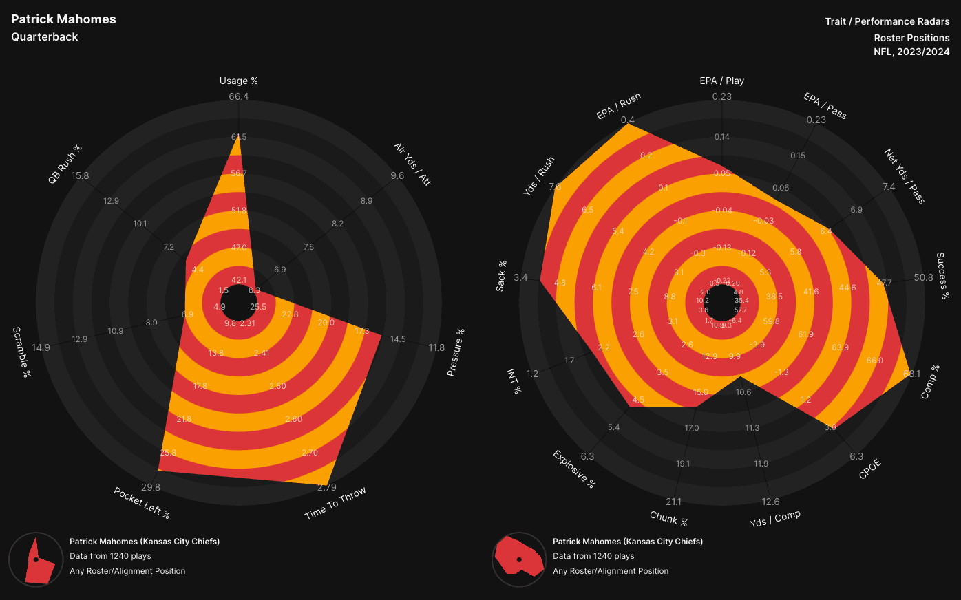
The trait radar is the one on the left, and there is what looks like a giant divot for the top right metric. That stat is air yds per pass attempt. Last season, Mahomes had the lowest air yards per attempt in the NFL. Having low air yards per attempt does not mean Mahomes was a bad quarterback, that was just how the offense was set up for the Chiefs last season. Because this statistic is more descriptive about how Mahomes plays the position, it is in the trait radar.
Moving on to the performance radar on the right hand side we can see statistics like CPOE, EPA / Pass, and Sack %. These are all metrics that describe the outcome on the field, and are no longer just describing how Mahomes plays the QB position. One of Mahomes top metrics was his sack % (of note, when a lower value is better, like sack % for a QB, that scale is reversed so big spikes still = better). Using the two radars hand in hand leads to easy analysis of players.
Conclusion
All of this can be completed with around 60 hours of work. The majority of this is done concurrently, and we are able to have a game go from start to finish with data uploaded onto our analysis platform in 16 hours on the clock. The things we learned from soccer allowed us to start with a great idea of where we wanted to go with our football product. This has allowed us to hit the ground running to create the best data, with the best tools in the market.


